Penguin, A-Z
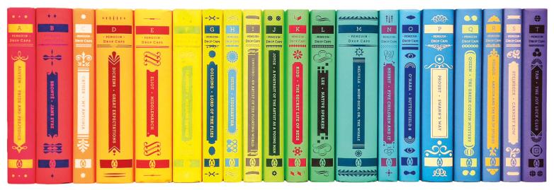
The Drop Caps series creates a striking alphabetic pop on the bookshelf
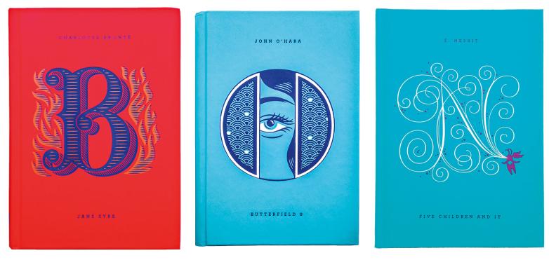
Penguin’s Drop Caps is a series that combines literature and art in a beautiful—and intrinsically collectible—set of books. Once complete this summer, twenty-six classic works of literature will have been republished in the Drop Caps, each hardcover featuring a specifically designed illustrated drop-cap letter by type designer Jessica Hische. The brainchild of Penguin designer Paul Buckley, the series creates a striking visual pop on the bookshelf.
“Great literature paired with great packaging. What’s not to love?” said Buckley.
The genesis for the series was the Daily Drop Cap blog produced by Hische in 2009. She illustrated a letter a day for twelve alphabets in a row and allowed individuals to use them to “prettify the Internet and beautify your [non-commercial] blog posts.” Thinking Hische’s work would be an excellent match for Penguin Classics, Buckley pitched a series based on it to editor Elda Rotor. Each hardcover was to be illustrated with a large capital letter, and a full color spectrum would be produced when the books were lined up in order. Rotor embraced the idea, and the Drop Caps were born.
Hische was excited by the opportunity. “It was such a thrilling project to work on for so many reasons. Doing covers for classic books is one of the things all design students dream about when they’re still in school, so being able to do so relatively early in my career was amazing.” Hische, who just turned thirty, has been featured twice in Forbes magazine’s “30 Under 30 in Art & Design” list.
After Rotor selected the titles for the series, Hische read the books, and then developed letter concepts by making word-association lists. “From those lists, I’d be able to generate a few visual concepts, which I represented with pencil sketches,” said Hische. “Paul [Buckley] and I would go over the pencils, and he presented them to Penguin (and the authors if they were available), and one direction would be chosen from there. Lastly, I’d create the artwork in Adobe Illustrator (my medium of choice for lettering) and hand over the two-color vector files to be foil stamped on the covers.
Buckley takes over at that point in the process. “I then experiment with a series of printer draw downs to find the two foil colors I want to work with on the particular color background we are on in the spectrum,” he said. “Then I design everything, the spine, the back, and the secondary type on the front.”
“I wanted this to be a design collaboration and that we’d be showcasing [Hische’s] glorious drop caps very large on the front,” said Buckley. “From its inception, it was a win-win for everybody.”
Hische’s letters are created specifically for each cover, incorporating story elements in either an abstract or literal way. “Some are quite narrative (like the G for Golding’s Lord of the Flies, which shows Piggy’s broken glasses as a lowercase g) and some more abstract, like the T that represents Amy Tan’s The Joy Luck Club by hiding the T in a Chinese symbol that represents the four seasons and the cycle of life, which I thought worked well for the four sisters in the story,” said Hische.
When asked about the collectability of the series, Buckley joked, “I think everyone on the planet should go straight out and buy all twenty-six. Right now. You all have my word that they will quadruple in value by the time you get home. Or that they will look gorgeous on your shelf and give you many hours of enjoyable, intelligent entertainment. One of those two things will happen. I promise.”


