Feature

A Quiet Revolution

Sarah Wyman Whitman was one of the first graphic designers in the American book industry, and her ideas propelled the art of the book into the modern era
Winter 2011 By Stuart Walker
book design
Photos: Boston Public Library
Sarah Wyman Whitman was one of the first graphic designers in the American book industry, and her ideas propelled the art of the book into the modern era
book design

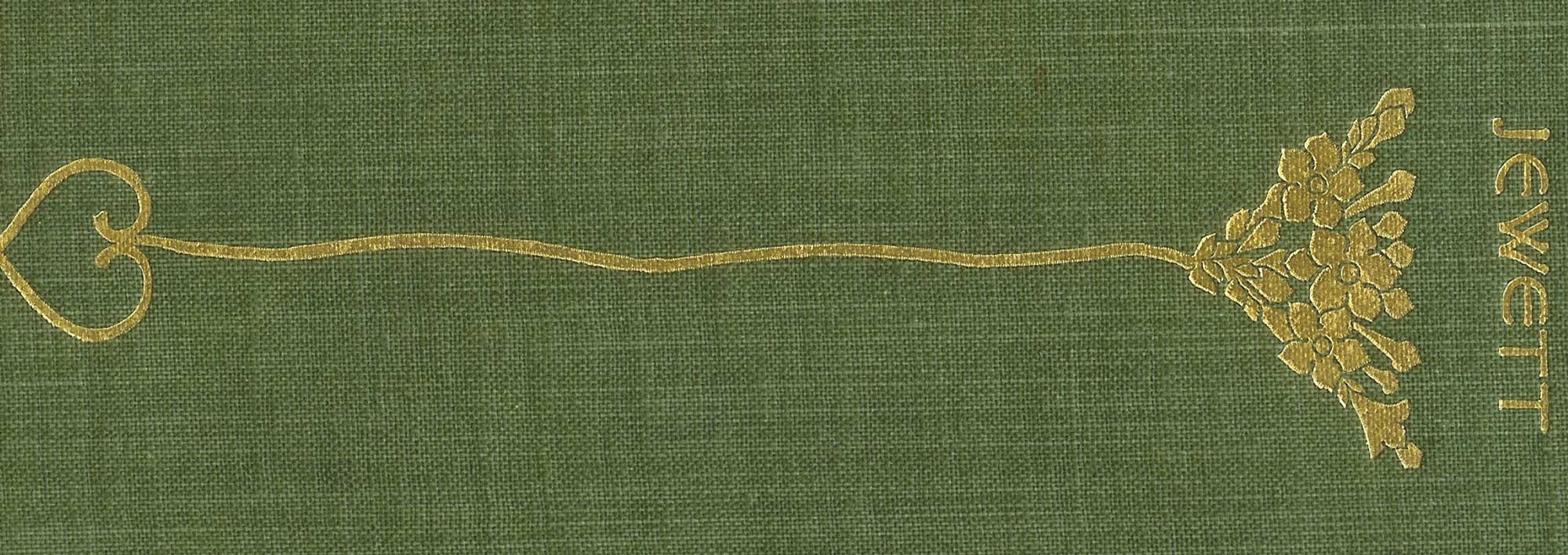
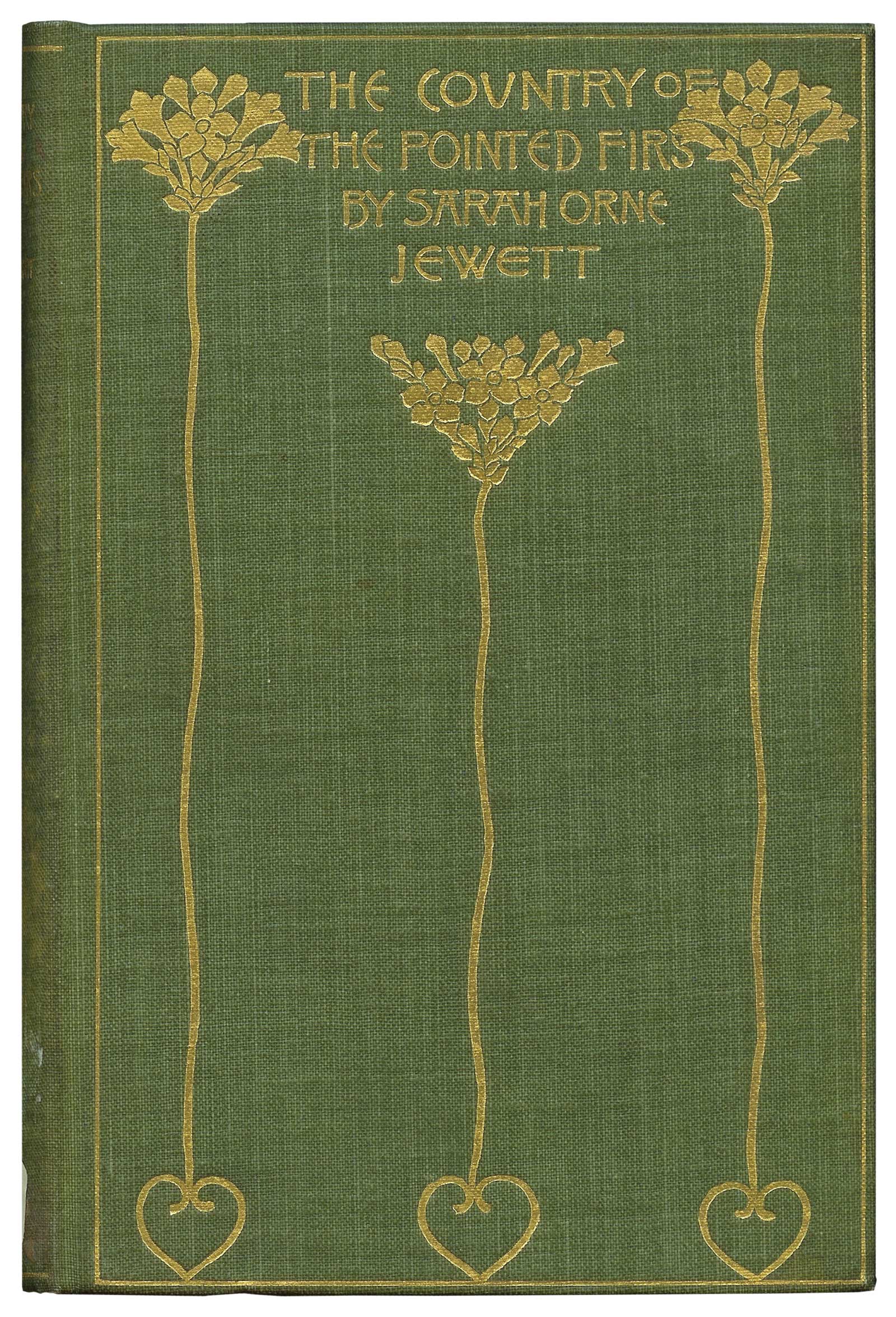
Whitman’s design for friend Sarah Orne Jewett’s The Country of the Pointed Firs (1897). This is one of the most prized volumes among Whitman collectors.

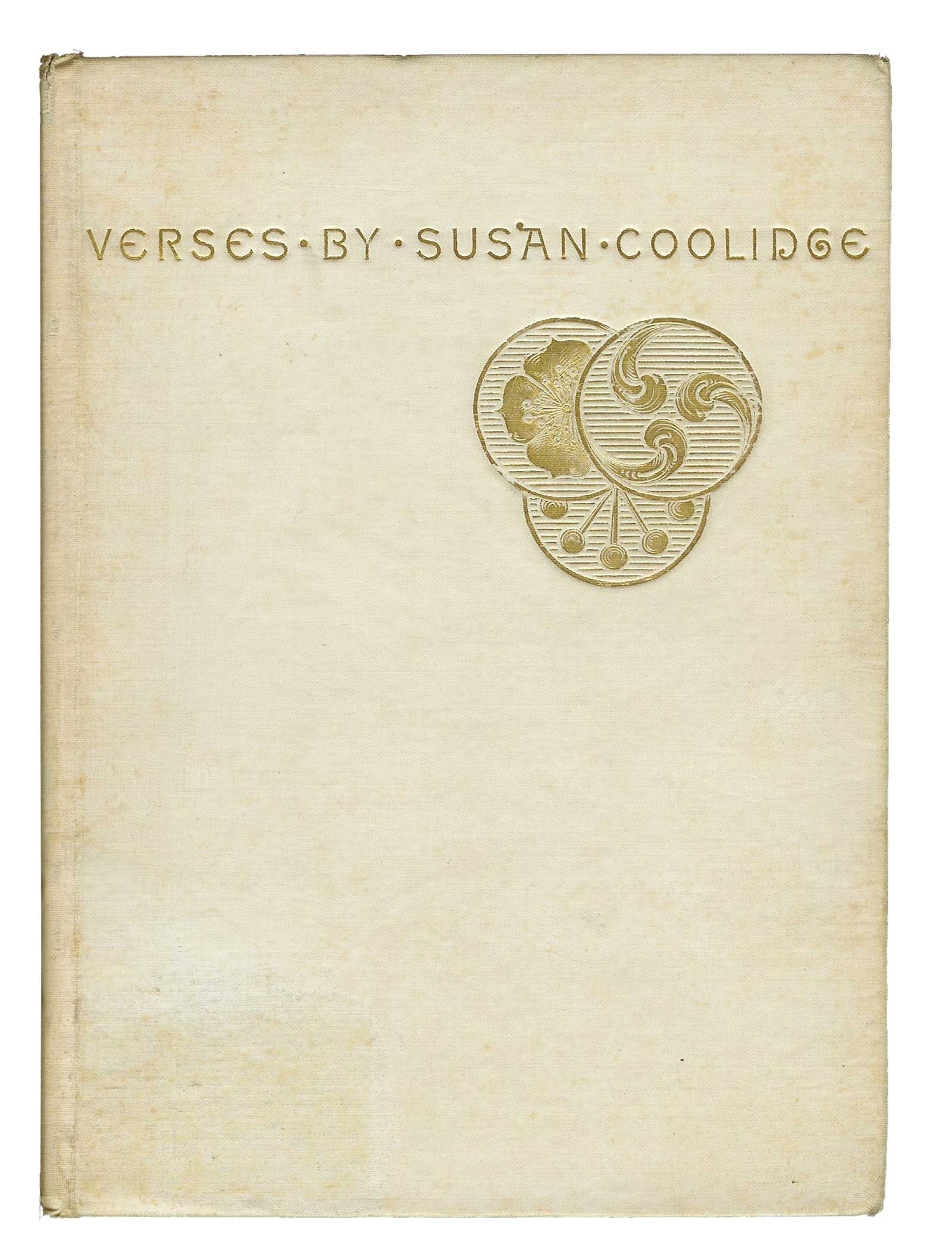
In 1880 a slim volume of poetry appeared that modern book collectors have come to see as the opening salvo in a revolution that had profound and long-lasting effects on commercial book production at the turn of the nineteenth century. Published by the Boston firm Roberts Brothers, it was written by Sarah Chauncey Woolsey using her pen name Susan Coolidge, and was titled Verses. Bound in white muslin stamped with a design of three gold medallions suggesting Japanese family crests, and titled with simple sans serif lettering, it was the antithesis of the florid, over-designed commercial bindings of the day. In their article “American Trade Bindings and Their Designers, 1880–1915,” Charles Gullans and John Espey called it “explosive” in the context of its time. The designer was the author’s friend Sarah Whitman, a Boston artist and socialite. 

Sarah Wyman Whitman (1842–1904) was born in Baltimore and moved to Lowell, Massachusetts, when she was young. She married Henry Whitman, a Boston wool merchant, and moved to Beacon Hill, where she counted among her friends many of the city’s and region’s brightest minds, including Oliver Wendell Holmes, William James, Sarah Orne Jewett, Annie Fields, and Charles Eliot Norton. Her first book designs were created for these writers. She studied art with William Morris Hunt, William Rimmer, and Hunt’s teacher Thomas Couture, exhibiting her work in Boston and in New York starting in the 1870s. In 1884 she inherited a quarter of a million dollars from an uncle, which established her as one of the richest women in Boston and left her free to pursue her artistic interests.

Whitman became the first real artist-designer in the American book industry. She revolutionized trade bookbinding by popularizing simple, spare designs created largely around a distinctive calligraphic lettering that is deliberately uneven and rustic, especially in the first examples, but which quickly developed a casual-seeming elegance. Many of her groundbreaking and most successful designs are based largely, or entirely, on lettering. She wrote that one of her teachers, Thomas Couture, had declared, “letters were the most beautiful embroidery in the world because it was an embroidery that spoke.” She often combined her rustic style with a highly refined and elegant, if somewhat stiff, formal style, using the former for the spine and the latter for the cover. The informal evolved fairly quickly from blocky and crude to simply eccentric, the “Whitman style” we are mostly familiar with; certain elements are distinctive, but were modified over the years. She was the first to design her own distinctive alphabet that was absolutely clear to the eye and that is immediately identifiable as hers. According to Gullans, the designers who followed her “strove to invent one or more markedly individual alphabets which would stand as signature and trademark alike.”

Whitman’s letters A, B, C, E, G, N, and S can be diagnostic. In the informal hand, the A is like that used by Durer, with a crossbar top. B, D, and N curl in at the bottom and usually do not rejoin the vertical stroke; this is especially true for D, which was widely imitated. E is mostly a shallow epsilon, though the early letters are nearly C-shaped. The center bar often ends with a trumpet-shaped serif. G is a sort of vortex whose uppermost end sometimes points slightly upward; S ranges in appearance from two labored C shapes to a sleek, angled slash that extends below the writing line. In the formal style, look for the usually rather small but sharp serifs. All her letters are hand drawn, and the careful observer will note slight variations between repeats. Dots are often used to separate words. 

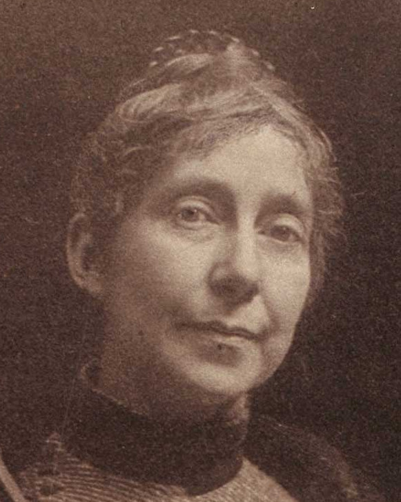
A black-and-white photograph of Sarah Wyman Whitman holding a palette and brushes. This is presumed to be the photograph used by Helen Bigelow Merriman as the basis for her posthumous portrait of Whitman. 

Credit: The Schlesinger Library, Radcliffe Institute, Harvard University.

In addition to her distinctive calligraphy, she created designs that were notable for what we would now call “negative space” and for using elements that generate a sort of balanced tension within a field. In the 1880s book cover design was controlled by engravers, die-cutters, and untrained office staff whose “level of taste…does not rise above what can only be called machine-shop style…Aesthetically, the designs rank with the contents of a whatnot shelf,” wrote Gullans. Whitman felt that industrialization and mechanization had created chaos in art as it had in life. In 1894 she wrote, “Ten years ago you would have found book covers, hundreds of them, which represented a combination of bad French art mixed with Japanese art; scrolls and arabesques, which had to do with some debased form of book cover mixed with a bit of Japanese fan, the suggestion of a sun, a stork, or strange diagonal lines, so beautiful in pure Japanese art but so fatal and terrible on a book.” 

Whitman’s design for Verses did away with that. However, as revolutionary as it was, it was clearly modeled on the design created in 1865 by Dante Gabriel Rossetti for the cover of Swinburne’s Atalanta in Calydon, which was in turn used by the Boston publisher Houghton, Osgood in 1878 for the binding of Bayard Taylor’s Prince Deukalion. The design incorporates four gold medallions engraved with simple designs that suggest ancient Greek or Etruscan patterns, perfectly balanced in their placement at the center left side of the cover and at each right corner. The design is clean, spare, and elegant, gold on white. Whitman, in her design, gathers and slightly overlaps the medallions, placing them to the right of center, below the line of uncial lettering, Verses by Susan Coolidge. The medallions, offset under the perfectly balanced lettering, create a design tension that is very effective. 

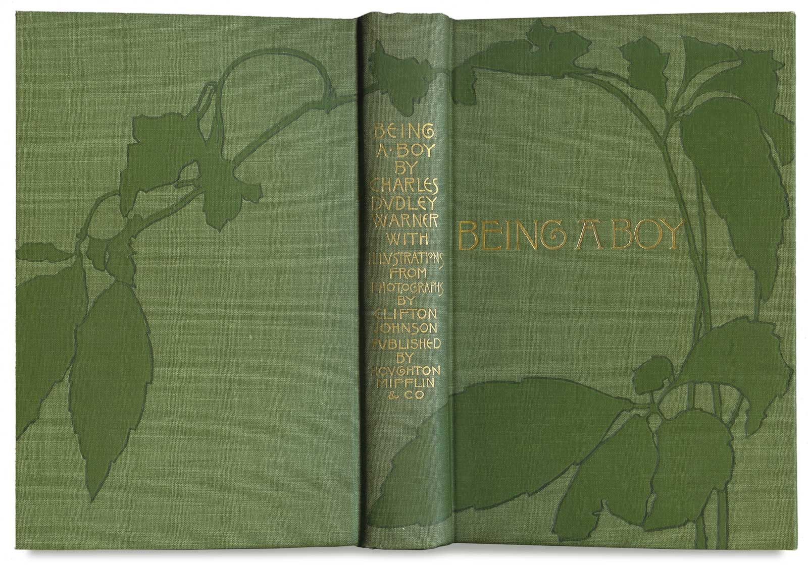
Whitman’s design for Charles Dudley Warner’s Being a Boy (1897), with its dark green leaves wrapped around both covers, has been called the best Art Nouveau trade binding ever produced in America.

PHOTO: BOSTON PUBLIC LIBRARY

Whitman was first mentioned by name in a trade publication in 1886, and the next year appeared for the first time in Houghton, Mifflin’s advertisements, which continued to use her name to boost sales until 1896. She pioneered the practice of signing her work, in 1889, initially on the title page of an edition of Holmes’ The Autocrat of the Breakfast-Table, using a logo of the initials SW within a flaming heart. (Unfortunately for collectors of her work, she is only known to have signed eight of her estimated 250 or so bindings.)  As Gullans has observed, Whitman was “a forerunner who was twenty-five years older than the reforming generation that observed, understood, and widely imitated her example in the early 1890s.” But though she represented the face of modernism at the start of her career, her work was eclipsed by the popularity of the poster style fifteen years later, and after the late 1890s she produced very few bindings. 

If imitation is the sincerest form of flattery, Whitman was indeed flattered, but the many imitations, by many publishers, of her designs and design elements—combined with the lack of a definitive list of her works (although the short chronological list published in Sue Allen and Charles Gullans’ unfortunately out-of-print paperback, Decorated Cloth in America, is an excellent start)—make it very difficult to be absolutely sure that certain books do or do not belong in a collection of her work. Many websites include books that cannot be attributed to her, and even Gullans’ list includes one book whose attribution is based on what appears to be a misinterpretation of a trade publication entry. 

American decorated publishers
1/4
Photos: Boston Public Library

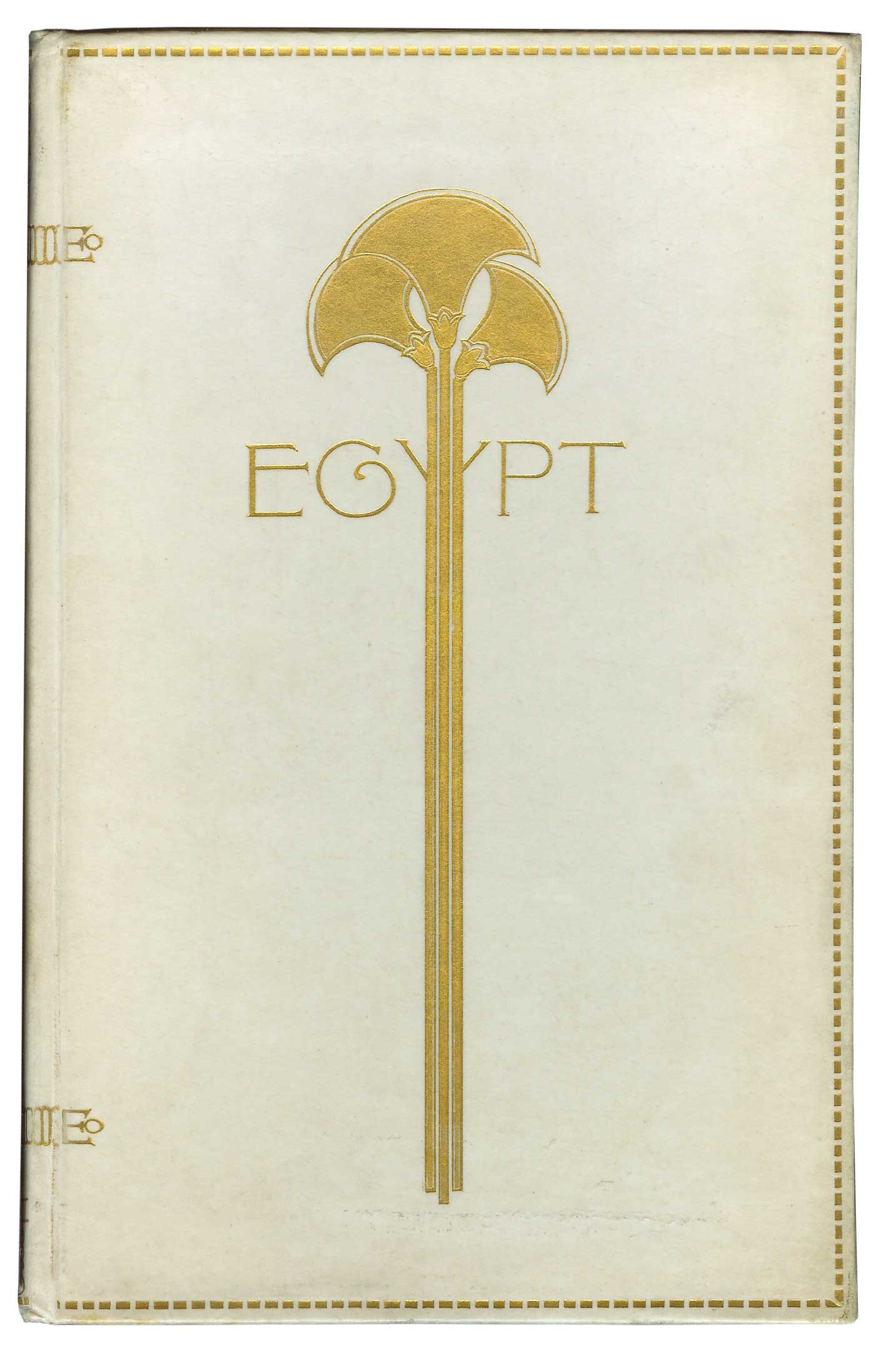
Egypt is seen as a primary example of the best in American decorated publishers’ bindings. It was issued in vellum stamped with gold, as seen here, and in blind-stamped suede. 

The Country of the Pointed Firs (1897)
2/4
Photos: Boston Public Library

Whitman’s design for friend Sarah Orne Jewett’s The Country of the Pointed Firs (1897). This is one of the most prized volumes among Whitman collectors.

Verses
3/4
Photos: Boston Public Library

In the late nineteenth century, Whitman rebelled against book cover design that was, in her words, “grotesque and over-wrought.” The simple elegance of her Verses spoke for itself.  

Whitman’s designs
4/4
Photos: Boston Public Library

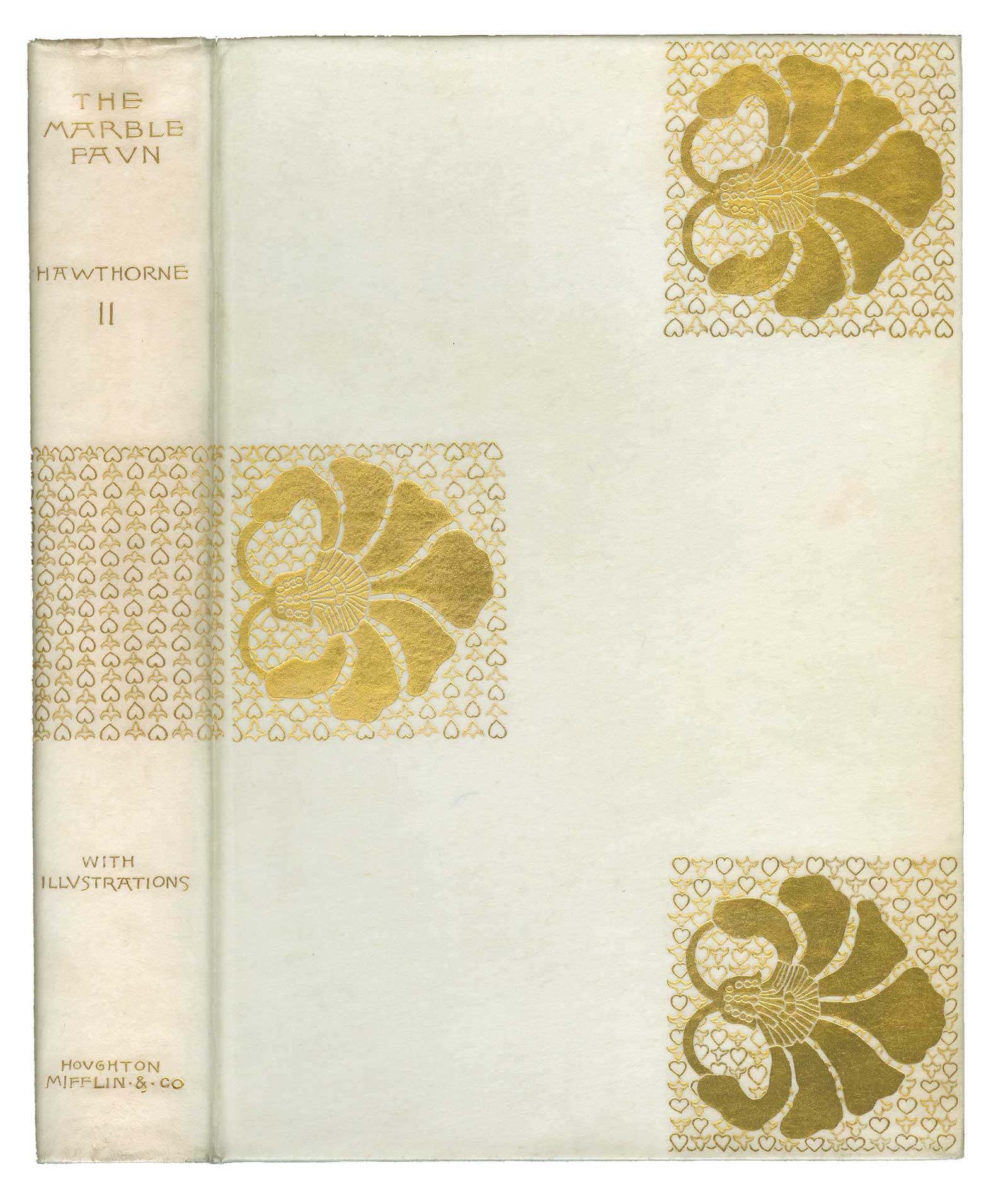
Many of Whitman’s designs were created for the Holiday Editions that Houghton, Mifflin issued as gift books just before Christmas each year. Most of these books, like The Marble Faun, were issued in cloth and were not limited editions, although their cost was usually greater than regular trade issues.

Rossetti’s influence on Whitman cannot be overstated. Two other designs that clearly influenced her are found on Swinburne’s Songs Before Sunrise (1879), which again uses three medallions set on an otherwise empty field, and Rossetti’s own Ballads and Sonnets (1881). This latter design features three squares of grillwork laid out so as to divide the field into nine parts, six of which are left empty. Rossetti also designed endpapers for this book covered with grillwork and scattered flowers, which inspired Whitman’s own endpapers of a grillwork of curlicues, usually printed in gold ink. Ballads and Sonnets was particularly influential as a design and was directly imitated in Whitman’s striking 1889 design for Houghton, Mifflin’s large-paper edition of Hawthorne’s Marble Faun, bound in gold-stamped vellum. In this design, the three squares hold large stylized flowers surrounded by a grillwork of hearts and trefoils. The middle square is carried across the spine, dividing the lettering, and is repeated on the verso. The design is stunning—sharp, clear, and powerful. Only 150 copies were issued, boxed with red cloth jackets with the title stamped in gold. This was the first of a series of vellum-bound, limited large-paper Holiday Editions Whitman designed for Houghton, Mifflin over the next ten years. Whitman’s remarkable 1899 Marble Faun design of undulating horizontal waterlilies, their stems wrapping around the book and connecting each volume to the next, is an Art Nouveau tour de force. It is bound in white cloth, with her signature flaming heart logo, lettering and design in gold. It is one of her most popular designs; unfortunately it is usually found without its original red cloth dust jackets and cloth-covered slipcase. 

One binding in particular, however, stands out from all the others. Martin Brimmer, the first director of the Museum of Fine Arts in Boston and Whitman’s close friend, wrote three essays on the history, art, and religion of ancient Egypt, which were published in 1891 by Houghton, Mifflin. Issued in gold-stamped vellum and blind-stamped suede, its design is nothing short of extraordinary. The lettering of the title, Egypt, is overlaid by three stylized papyrus plants representing the Nile River and delta. Gullans wrote of it: “The design…is one of the most striking images in American book design of any period. It is masterly in its proportions, its spacing, and its daring simplification.”  

Most of her designs are symbolic, incorporating stylized floral shapes combined with calligraphy. In her best designs, there is a spare elegance, a kind of quiet repose. She popularized the three-piece cover, frequently using white cloth for the spine and a contrasting color and texture for the covers. Although she did produce some early designs that were realistic (examples include the first two novels by “Charles Egbert Craddock” and F. Hopkinson Smith’s Well-Worn Roads of Spain, Holland, and Italy), she never worked in the “poster” style that came to dominate late nineteenth–century book design. Betty S. Smith, author of the article, “Sarah Wyman Whitman: Brief Life of a Determined Artist, 1842–1904,” which appeared in Harvard Magazine, called Whitman the “first professional woman artist regularly employed by [an American] publisher to give their mass-produced book covers a sense of simple elegance through line, color, and lettering.” 

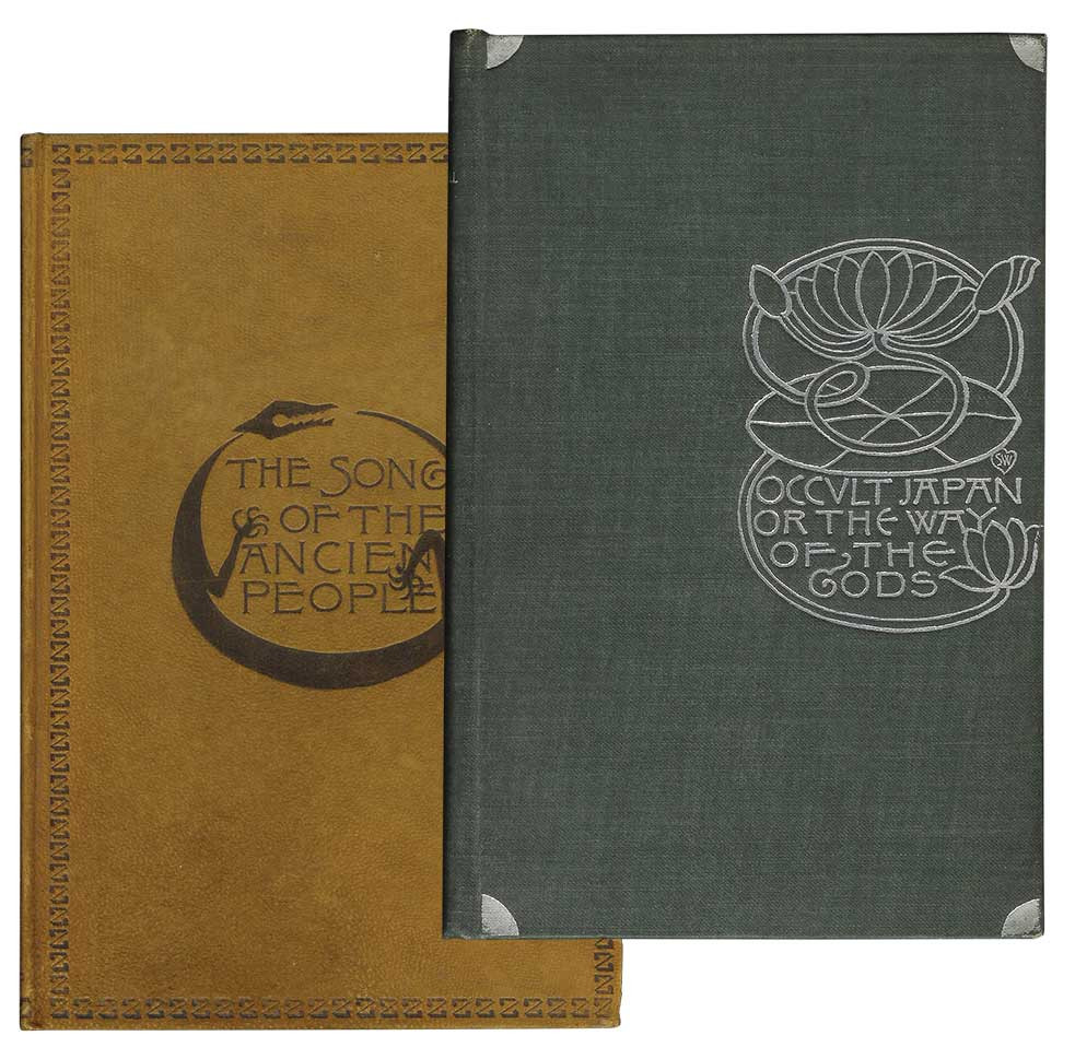
The Song of the Ancient People / Occult Japan, or The Way of the Gods

Photos: Boston Public Library

The great majority of her work was done for Houghton, Mifflin. There is no firm evidence that she designed books for D. Lothrop, Dodd, Mead, Cupples and Hurd, or T. Y. Crowell, who all produced books strongly resembling her work. Roberts Bros., who published her first confirmed design, published several other books designed by her until 1895; most of these were written by “Susan Coolidge.” The Boston Public Library has a large working collection of images of her work, but this is not yet fully edited and includes some books that are not her work. There is something about the totality of Whitman designs, the “zen” of Whitman that, after exposure to many examples, reveals itself to collectors. Her work is distinguished by what Allen called its “grace, reserve and singularity.”  

Collectors of Whitman’s bindings compete for a number of iconic books, many of which are rare and expensive. The limited vellum editions include Hawthorne’s Our Old Home (1891), The Scarlet Letter (1892), and The House of Seven Gables (1899), Longfellow’s Song of Hiawatha (1890, with illustrations by Frederick Remington), Oliver Wendell Holmes’ Dorothy Q (1893) and The Autocrat of the Breakfast Table (1894), and James Russell Lowell’s Vision of Sir Launfal (1888, deluxe folio with leather spine and paper sides, and 1891, vellum). Mariana Griswold Van Rensselaer’s epic Henry Hobson Richardson and His Works (1888) is still considered the most authoritative work on Richardson; Whitman’s binding evokes the medievalism of the architect’s designs. Her design for Percival Lowell’s Occult Japan, or The Way of the Gods (1894) is elegant and serene, evoking Japanese design, and appears to have influenced Dard Hunter’s design for the1907 Roycrofters’ White Hyacinths. Celia Thaxter’s An Island Garden, illustrated by Childe Hassam (1894), Thoreau’s Cape Cod (1896) and Walden (1897), and the novels of Sarah Orne Jewett, especially The Country of the Pointed Firs (1896), are all sought after. One which is very hard to find in good condition is her 1893 suede binding for Edna Dean Proctor’s The Song of the Ancient People, a poetical tribute to the Moquis and Zunis. Based on a traditional design, the cover features a modernistic, almost abstract lizard encircling the calligraphic title, its feet treading on the lettering. Whitman often overlaps calligraphy and imagery, partially obscuring the lettering.